If you have ever sat in a project meeting and heard someone say "that's a high risk" while another person insists it is only a medium, you have experienced the core problem a risk matrix solves. Without a shared framework for evaluating risks, every assessment is subjective and every prioritisation debate goes in circles.
The 5×5 risk matrix gives your team a common language. It maps every risk onto two dimensions (probability and impact), produces a numerical score, and sorts risks into colour-coded priority levels that everyone can understand at a glance. This guide explains exactly how it works, what each level means, and how to use it on real projects.
What is a 5×5 risk matrix?
A risk matrix (sometimes called a risk assessment matrix or probability-impact matrix) is a grid that plots risks according to two factors: how likely they are to happen and how severe the consequences would be if they did.
The "5×5" refers to the scale: both probability and impact are scored from 1 to 5, creating a 25-cell grid. Each cell represents a specific combination of likelihood and severity, and the product of the two scores (1 to 25) determines the overall risk level. The matrix is a core component of any risk register, giving you a consistent framework for prioritising which risks need attention first.
There are smaller matrices (3×3, 4×4) used for simpler assessments, but the 5×5 provides the right balance of granularity and simplicity for most project work. It is detailed enough to differentiate between risks meaningfully, but not so complex that scoring becomes an academic exercise.
The two axes: probability and impact
Probability (likelihood)
The vertical axis measures how likely a risk is to occur. Each level on the 1 to 5 scale represents a step up in likelihood:
Score |
Label |
Description |
Real-world example |
|---|---|---|---|
1 |
Rare |
Highly unlikely; no precedent |
Office building struck by lightning during the project |
2 |
Unlikely |
Could happen but not expected |
Key vendor goes out of business |
3 |
Possible |
Reasonable chance; has happened before |
Supplier misses a delivery deadline by a week |
4 |
Likely |
More probable than not |
Scope changes requested after design sign-off |
5 |
Almost Certain |
Expected to happen |
Staff pushback on a major process change |
When scoring probability, draw on your team's experience and, where possible, historical data from similar projects. If your organisation has completed similar projects before, past records are far more reliable than gut feel.
Impact (severity)
The horizontal axis measures the severity of consequences if the risk materialises. Impact should be assessed against what matters most on your project: schedule, cost, quality, safety, or reputation.
Score |
Label |
Description |
Real-world example |
|---|---|---|---|
1 |
Negligible |
Barely noticeable; absorbed by normal buffers |
A meeting gets rescheduled by a day |
2 |
Minor |
Small setback; requires minor adjustment |
One deliverable slips by a few days |
3 |
Moderate |
Noticeable effect on schedule, budget, or quality |
A phase runs two weeks late, pushing the whole timeline |
4 |
Major |
Significant disruption requiring senior attention |
Budget overrun of 20%+ requiring board approval |
5 |
Catastrophic |
Threatens project viability or causes severe loss |
Safety incident on site; project halted by regulators |
Tip: Agree on what each impact level means for your specific project before you start scoring. A two-week delay is "moderate" on a 12-month construction project but "catastrophic" on a four-week product launch. Calibrating the scale to your context prevents endless debates.
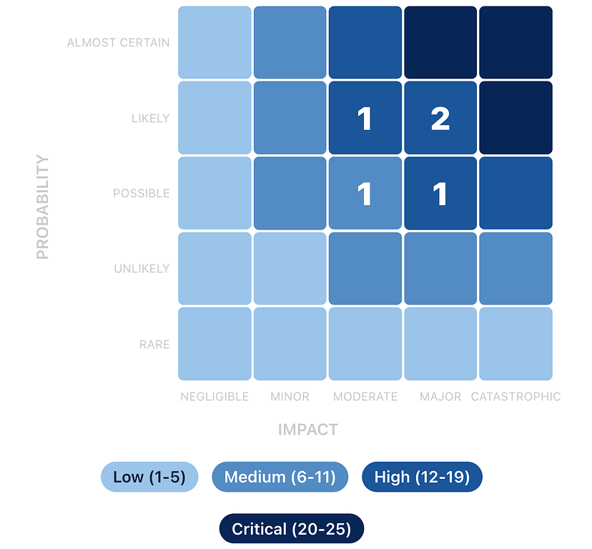
The matrix: how scores map to risk levels
When you multiply probability by impact, you get a score from 1 to 25. Here is the full 5×5 matrix with every cell mapped to a risk level:
Negligible (1) |
Minor (2) |
Moderate (3) |
Major (4) |
Catastrophic (5) |
|
|---|---|---|---|---|---|
Almost Certain (5) |
5 Low |
10 Medium |
15 High |
20 Critical |
25 Critical |
Likely (4) |
4 Low |
8 Medium |
12 High |
16 High |
20 Critical |
Possible (3) |
3 Low |
6 Medium |
9 Medium |
12 High |
15 High |
Unlikely (2) |
2 Low |
4 Low |
6 Medium |
8 Medium |
10 Medium |
Rare (1) |
1 Low |
2 Low |
3 Low |
4 Low |
5 Low |
Risk levels: Low (1 to 5) · Medium (6 to 11) · High (12 to 19) · Critical (20 to 25)
What each risk level means
Low (score 1 to 5)
Low risks are unlikely to happen and would cause minimal damage if they did. These sit in the bottom-left corner of the matrix. You should record them in your risk register for completeness, but they do not need active mitigation plans. Review them periodically (monthly or at major milestones) to check whether conditions have changed.
Example: A minor design revision requested by a secondary stakeholder. Probability: 2 (Unlikely). Impact: 2 (Minor). Score: 4.
Action: Monitor. No dedicated mitigation needed.
Medium (score 6 to 11)
Medium risks are plausible and would cause a noticeable setback. They occupy the middle band of the matrix. These need a documented response plan, even if the plan is straightforward. Review them at least fortnightly and escalate if conditions change.
Example: A furniture supplier delivering late due to supply chain issues. Probability: 3 (Possible). Impact: 3 (Moderate). Score: 9.
Action: Identify backup suppliers. Build a one-week buffer into the schedule for this dependency.
High (score 12 to 19)
High risks are the ones that keep project managers up at night. They are either very likely, very impactful, or an uncomfortable combination of both. These need active mitigation plans, assigned owners, and weekly (or more frequent) review. Senior stakeholders should be aware of all High risks.
Example: IT infrastructure not ready on move-in day. Probability: 4 (Likely). Impact: 4 (Major). Score: 16.
Action: Start IT setup two weeks early. Schedule a full systems test. Prepare a rollback plan (temporary Wi-Fi hotspots and cloud access) if the main setup fails.
Critical (score 20 to 25)
Critical risks threaten the project's success or viability. They demand immediate executive attention and typically require changes to the project plan. Only a few cells on the matrix reach this level, and any project with active Critical risks should be treating them as the number one priority.
Example: A safety incident on a construction site forcing a regulatory shutdown. Probability: 5 (Almost Certain, given the complexity of the work). Impact: 4 (Major). Score: 20.
Action: Mandatory daily safety briefings. Independent safety audit before work begins. Incident response plan documented and rehearsed. Direct line to site safety officer.
Tip: When you present risks to stakeholders, lead with the Critical and High risks. A visual heat map showing the concentration of risks across the matrix is far more persuasive than a table of numbers. It immediately answers the question: "Should I be worried?"
Scoring risks in practice: a worked example
Let us walk through scoring a real risk to see how the matrix works in practice.
Project: A software company migrating its main product from an on-premise server to a cloud infrastructure.
Risk: Data loss during the migration due to an incomplete backup process.
Assessing probability: The team has never performed a migration at this scale before. The backup process has been tested on smaller datasets but not on production data. However, they have allocated time for a dry run before the actual migration. Score: 3 (Possible). It could happen, but the dry run provides some confidence.
Assessing impact: If production data is lost and the backup is incomplete, the company faces potential downtime, customer data loss, and regulatory exposure. This would require significant resources to recover from and could damage customer trust. Score: 5 (Catastrophic).
Risk score: 3 × 5 = 15 (High).
Even though the probability is only "Possible," the catastrophic impact pushes this firmly into the High zone. The matrix ensures that low-probability but devastating risks get the attention they deserve, which is one of the key strengths of using a structured scoring approach rather than gut feel.
Residual risk: scoring after mitigation
Your initial score (called the inherent risk score) tells you where a risk stands before any mitigation. After you put treatment plans in place, you can re-score to get the residual risk score, which reflects the expected risk level after your mitigations take effect.
For the data migration example above, suppose the team decides to implement a full backup verification process, run two complete dry runs before the actual migration, and set up a parallel environment that can be rolled back to within four hours. The residual scores might be:
Probability drops from 3 to 2 (Unlikely, because the dry runs will catch backup gaps). Impact drops from 5 to 3 (Moderate, because the rollback environment limits the worst-case downtime). Residual score: 2 × 3 = 6 (Medium).
Tracking both inherent and residual scores shows your stakeholders the value of your mitigation efforts. It answers the question: "What would happen if we did nothing?" versus "What happens with our plan in place?"
Common mistakes when using a risk matrix
Scoring everything as a 3. When teams are unsure, they default to the middle of the scale. This clusters all risks in the same zone and defeats the purpose of prioritisation. Push the team to commit: is it really a 3, or is it actually a 2 or a 4? The difference matters.
Conflating probability and impact. A common error is letting severity influence how likely you think something is. "That would be really bad, so it must be likely." Keep the two assessments separate. Earthquake-level events can be catastrophic in impact but rare in probability.
Ignoring the "Almost Certain + Minor" corner. Risks in the top-left of the matrix (high probability, low impact) score Low but can be surprisingly draining. Something that happens every week and costs a small amount of time adds up. Consider whether frequent low-impact risks are actually a systemic issue that deserves a different kind of attention.
Never updating scores. Risk scores are not set in stone at project kickoff. As the project progresses, new information changes both probability and impact. A risk that was "Possible" three months ago might now be "Likely" based on what you have learned. Regular rescoring keeps your priorities accurate.
Using the matrix in isolation. The matrix is a prioritisation tool, not a decision-making tool. A score of 12 does not automatically tell you what to do about a risk. It tells you that you need to do something and that it should be a priority. The treatment strategy and specific actions still require judgement.
When to use a different matrix size
The 5×5 matrix is the most widely used, but it is not the only option.
A 3×3 matrix (Low / Medium / High on each axis) works well for very simple projects, initial screening, or when you need a quick first pass. The trade-off is less granularity: you lose the ability to differentiate between risks in the same band.
A 4×4 matrix is a middle ground sometimes used in organisations that find five levels too granular but three too coarse.
For most project teams, the 5×5 matrix hits the sweet spot. It provides enough resolution to meaningfully prioritise risks without requiring so much precision that the scoring process becomes a burden. It is also the most widely understood format, making it easier to communicate with stakeholders, auditors, and partners who are likely familiar with the framework.
See the 5×5 matrix in action. Try Riskjar free. Every risk you add is automatically plotted on an interactive heat map. Colour-coded scores, visual prioritisation, and real-time updates as your project evolves.
Putting the matrix to work
The 5×5 risk matrix works because it replaces subjective arguments with a shared, consistent framework. When everyone on the team uses the same scales and the same thresholds, risk discussions become productive rather than circular.
Start by agreeing on what each level means for your specific project. Then score your risks as a team, letting the matrix surface the priorities. Review and rescore regularly. Use the visual heat map to communicate status to stakeholders. And remember that the matrix is a tool for better decisions, not a substitute for them. If you are still tracking risks in Excel, the matrix is one of the things that gets significantly easier when you move to a dedicated tool.
The next time someone says "that's a high risk," you will have a concrete, shared definition of exactly what that means.